By John DeMato
The Art Of Visual Punctuation
The Art Of Visual Punctuation https://csuiteold.c-suitenetwork.com/advisors/wp-content/themes/csadvisore/images/empty/thumbnail.jpg 150 150 John DeMato https://secure.gravatar.com/avatar/16462635c0dc0f49277b2f721421a192?s=96&d=mm&r=gSee the art of visual punctuation in action…
…as illustrated by one of my clients.
It’s one thing to simply talk about how to properly leverage your image content.
I mean, I can talk – and HAVE talked – until I’m blue in the face about how important it is to use your images in a way that visually punctuates the sentiment and emotion of every story that you share with your audience.
It’s quite another to see it actually play out effectively on a living, breathing, social media feed.
One of my clients who is an expert at leveraging her images to visually punctuate her content is health and nutrition speaker/coach, Kristi Data.
I conducted a session with her a couple months ago, and since that time, she’s been burning up the socials with a barrage of image content that, quite frankly, makes me smile every time I see a new post pop onto my newsfeeds…
…not because everything she writes is sunshiney and happy-time, mind you; my joy derives from the way that she identifies and leverages photos from her massive, image content library to aptly compliment the informative and inspiring stories and lessons she shares with those she serves.
Although Kristi posts a variety of branded lifestyle portraits and cameraphone images of herself, the posts that truly capture my attention are her quote posts.
Quote posts are when you incorporate a phrase, sentence or paragraph directly onto an image – usually positioned in the space opposite the person sitting in the frame – in order to give your audience the chance to easily digest the sentiment before they move on to read the story listed in the caption.
These images are a wonderful way to simultaneously create a powerful piece of content, while also being visually attractive enough for your audience to stop, click and read the post.
I went to her Instagram feed and pulled a couple examples to specifically illustrate what I mean. Although Kristi generally complements these quote posts with a long-form story, I just want to focus on the actual image content for the purposes of this conversation.
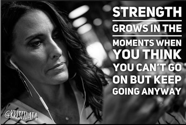
VISUAL PUNCTUATION EXAMPLE #1 – REFLECTIVE

This image/quote pairing is wonderful for many reasons.
Her facial expression immediately reads as focused and reflective as she works on her phone. When you factor in the dramatic lighting on her face, that further enhances this sentiment because it creates a very moody vibe, which speaks to the “moments when you think you can’t go on…” section of the quote.
In addition, the black and white tone strips away all potential distractions in the frame, which allows the viewer to focus on only two things – the facial expression and the words. And, since the words are adjacent to the expression, the impact of the overall message is extremely palpable.
Everything in this image aims to visually punctuate the quote, which then compels the viewer to scroll down and read on to learn more.
VISUAL PUNCTUATION EXAMPLE #2 – EMPOWERMENT

I’m a sucker for capturing magical smiles – it’s ever-present in all of my work, which makes sense since I work with speakers, authors and coaches who empower their clients get past what’s holding them back in order up to show up in the world exactly the way they want.
A natural smile is a testament to this goal.
In the case of this image, Kristi’s smile is a wonderful visual punctuation of the sentiment of “choosing her(self)” over other influences in her life that doesn’t serve her ultimate goals and purpose in life.
Whereas in the first image where black and white served to enhance a reflective and pensive tone to the image, the color in this photo serves as a perfect compliment to the empowerment tone of the quote.
It’s bright and lively – and that’s how you will view life if you choose you over all else,
It’s addition by subtraction – and this photo visually punctuates that sentiment.
VISUAL PUNCTUATION EXAMPLE #3 – CATCHY

I love the play on words here, and this portrait – her expression, in particular – truly visually punctuates that catchy sentiment.
I wouldn’t say her smile is devious or sneaky, but, it has this level of quirk and smirk to it that aptly complements the “slay” portion of the phrase on the right side of the image.
I’d also say that her smile has a certain level of confidence and badassness to it, which also visually supports the phrase, overall.
On a more technical note, her text placement on the image is lovely because it falls directly in line with the severely out-of-focus portion of the image, which gives it a natural resting place within the image.
When you create your own quote posts, be sure to place your text in the image in a way that doesn’t obstruct or distract from the main area of attention – in this case, her body and face. If you do, it will disrupt the visual balance of the frame and not present itself as well as it should.
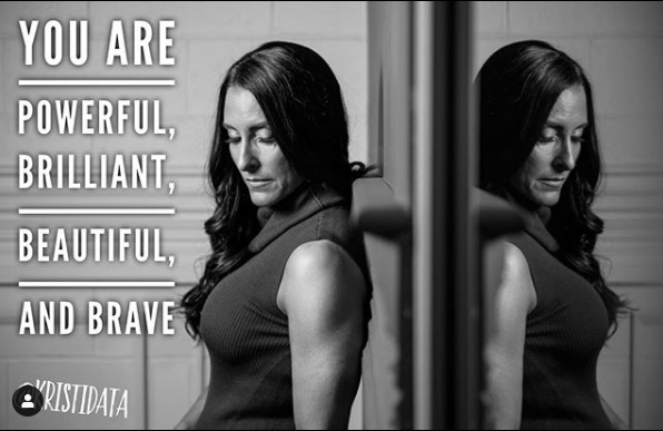
VISUAL PUNCTUATION EXAMPLE #4 – AFFIRMATION

In this post, Kristi used a black and white image again to enhance a sentiment of reflection, but, this time, the image is meant to visually punctuate a powerful affirmation.
Before I took out the color in this photo, her top is burgundy and the wall is a salmon/pink – all of that color is a bit distracting, so, choosing a desaturated image only serves to bring the audience’s attention to her facial expression, head angle, and the quote itself.
What I find very compelling about this image/text combo is that it feels like Kristi is saying this affirmation over and over again in her head, as she looks down and repeats it to herself as if it were her daily mantra.
It’s an interesting and powerful way to visually express the importance of this sentiment to her audience.
Her reflection on the right side of the frame only serves as an amplification of the importance of repeating this positive and empowering self-talk to yourself – and, I mean, it does add a cool, visual wrinkle to the image overall, too
As you can see, when you capture a variety of branded lifestyle portraits across a wide emotional range, you have a lot of creative opportunities to leverage these images in a way that visually punctuates the sentiments of the stories and messages that you share with your audience.
My hope is that you will see the flexibility within your own image content portfolios and start creating magical posts that move your audience to get past what’s holding them back,
John DeMato is a NYC branded lifestyle portrait photographer and content creation expert who serves speakers, authors, coaches and high-level entrepreneurs across the country. His 50+ e-book, S.H.A.R.E. M.A.G.I.C.A.L. I.D.E.A.S., lays out the how, what and why behind creating a memorable and referable online presence – sign up to get your FREE copy today.


